Understanding Assignments on Describing Bivariate Data

Claim Your Discount Today
Get 10% off on all Statistics homework at statisticshomeworkhelp.com! Whether it’s Probability, Regression Analysis, or Hypothesis Testing, our experts are ready to help you excel. Don’t miss out—grab this offer today! Our dedicated team ensures accurate solutions and timely delivery, boosting your grades and confidence. Hurry, this limited-time discount won’t last forever!
We Accept


- What Is Bivariate Data?
- Step-by-Step Strategy for Solving Describing Bivariate Data Assignments
- 1. Understand the Nature of the Variables
- 2. Start With a Scatterplot
- 3. Calculate Pearson’s Correlation Coefficient (r)
- 4. Understand Properties of Pearson’s r
- Dealing With Real Assignment Prompts
- Example Prompt Type 1: Construct a Scatterplot
- Example Prompt Type 2: Compute or Interpret r
- Example Prompt Type 3: Analyze Outliers or Non-Linearity
- Common Theoretical Mistakes to Avoid
- Software Tips for Handling Bivariate Data Assignments
- Microsoft Excel
- R
- Python (pandas & seaborn)
- Assessment Rubric Expectations (From a Theoretical Angle)
- Final Thoughts: Building Your Statistical Intuition
In the realm of statistics education, understanding bivariate data is a key milestone. Assignments centered around "Describing Bivariate Data" are designed to cultivate a student's ability to analyze the relationship between two quantitative variables. These tasks are more than exercises—they serve as practical applications of fundamental statistical theory. Whether you're working through correlation, scatterplots, or Pearson’s r, success hinges on your ability to interpret, compute, and communicate these relationships clearly and accurately.
This blog offers a theoretical walkthrough for students on how to tackle assignments involving describing bivariate data, especially those like the ones typically found in university-level introductory statistics courses. While inspired by materials such as the Online Statistics Education textbook by David Lane and colleagues, the focus here is on providing generalizable strategies applicable to similar academic exercises—and can serve as a valuable statistics homework help resource for those seeking to improve their understanding and performance.
What Is Bivariate Data?

Bivariate data involves two quantitative variables measured on the same subjects. It allows analysts to explore potential relationships, patterns, and associations between variables—such as age and income, or study time and GPA—using tools like scatterplots and correlation coefficients to understand strength, direction, and type of linear relationships. Bivariate data refers to data that includes two variables and examines the relationship between them. These two variables are often both quantitative, but can occasionally include qualitative-quantitative combinations.
For example:
- Height vs. Weight
- Hours Studied vs. Exam Score
- Income vs. Education Level
The goal in these assignments is typically to:
- Visualize the relationship
- Quantify the strength and direction of the relationship
- Interpret the statistical and contextual significance
Step-by-Step Strategy for Solving Describing Bivariate Data Assignments
Begin by identifying variables, then plot a scatterplot to visualize trends. Calculate Pearson’s r to assess linear correlation strength. Interpret the graph and statistic together. Always consider the presence of outliers, linearity, and variable context. Finally, communicate findings clearly using proper terminology and structured interpretation within academic guidelines.
1. Understand the Nature of the Variables
Begin by identifying:
- Whether both variables are quantitative (necessary for correlation)
- If one variable might be considered the predictor (X) and the other the outcome (Y)
Understanding variable roles is essential when it comes to interpretation and visualization.
2. Start With a Scatterplot
Almost every assignment of this type will begin with plotting the two variables on a scatterplot:
- The X-axis typically holds the independent variable.
- The Y-axis holds the dependent variable.
Key considerations in interpreting scatterplots:
- Direction: Positive or negative trend?
- Form: Linear or curvilinear?
- Strength: Are the points closely clustered or widely scattered?
- Outliers: Any obvious anomalies?
Describing the scatterplot in complete sentences is important. Avoid vague phrases—be specific, e.g., “There is a strong positive linear relationship between study hours and test score.”
3. Calculate Pearson’s Correlation Coefficient (r)
Most bivariate data assignments involve computing or interpreting Pearson’s r. The formula itself is:
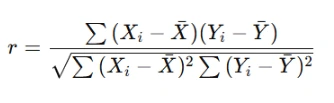
However, in real assignments, you will either:
- Be asked to manually compute r using a small dataset (often using software or Excel), or
- Interpret a given value of r.
Interpretation framework:
- r = 0 → No linear correlation
- 0 < r < 0.3 → Weak positive correlation
- 0.3 ≤ r < 0.7 → Moderate positive correlation
- 0.7 ≤ r ≤ 1 → Strong positive correlation
- Negative values mirror the same scale for negative relationships
4. Understand Properties of Pearson’s r
Many assignments include conceptual questions about the properties of r. Remember:
- r is unitless
- r is symmetric: correlation between X and Y is the same as Y and X
- r is sensitive to outliers and linearity
Include this knowledge in essay or short-answer responses to gain full credit.
Dealing With Real Assignment Prompts
Assignments often involve tasks like plotting scatterplots, computing Pearson’s r, or interpreting given correlation values. Some questions may explore outlier impact or non-linear trends. Focus on context-based interpretation, correct graphing, and articulating limitations. Use structured responses that combine technical accuracy with narrative insight to fully address prompts.
Let’s now map this understanding onto the types of questions you're likely to encounter.
Example Prompt Type 1: Construct a Scatterplot
You are given a table of X and Y values (e.g., Age and Blood Pressure). The question asks you to:
- Construct a scatterplot
- Describe the relationship
Response approach:
- Use graphing tools (Excel, R, etc.) or plot by hand.
- Write a paragraph: “As age increases, there appears to be a moderate, positive, and roughly linear relationship with blood pressure, with some variability in older age ranges.”
Example Prompt Type 2: Compute or Interpret r
You may receive:
- Raw data
- A summary table
- A correlation matrix
If computing manually, double-check:
- You center your variables (subtract means)
- Use correct formulas for variance and covariance
If interpreting:
- Mention both the magnitude and direction
- Avoid causation claims unless the study design permits
Sample interpretation: “The correlation coefficient of 0.68 indicates a moderately strong positive linear relationship between study time and GPA.”
Example Prompt Type 3: Analyze Outliers or Non-Linearity
Often, assignments present a dataset with an outlier and ask how it affects r.
Key response points:
- State that outliers can dramatically alter correlation values
- Show a version with and without the outlier (if possible)
- Discuss the effect on the scatterplot visually and numerically
Common Theoretical Mistakes to Avoid
Students often misinterpret correlation as causation, ignore outliers' effects, or apply Pearson’s r to non-linear relationships. Some misuse formulas or report r beyond the -1 to +1 range. Failing to explain results in context is another frequent error. Always interpret data carefully and respect statistical assumptions and limitations.
- Assuming Causation from Correlation
- Ignoring Linearity Assumption
- Misreporting r Values
- Neglecting Contextual Interpretation
Correlation ≠ Causation. Always clarify that unless the data comes from a well-designed experiment, causation cannot be inferred.
Pearson’s r assumes a linear relationship. If the data is curved, r might be low even if the variables are strongly related.
Values must lie between -1 and +1. Anything outside this range suggests a calculation error.
Statistics is not just about numbers. Always contextualize findings: e.g., “In the context of school performance, this suggests that more study hours are generally associated with better grades.”
Software Tips for Handling Bivariate Data Assignments
Use Excel (=CORREL) for quick correlation and scatterplot tools. In R, apply cor() and plot() for deeper control. Python’s pandas and seaborn libraries are also effective. Always verify your dataset, label axes clearly, and double-check correlation directions and magnitudes before drawing academic conclusions from software output.
Microsoft Excel
- Use =CORREL(array1, array2) to compute Pearson’s r.
- Use the "Insert → Scatter" chart to plot.
R
cor(data$X, data$Y)       # Compute correlation
plot(data$X, data$Y)      # Scatterplot
Python (pandas & seaborn)
df.corr()                 # Correlation matrix
sns.scatterplot(x='X', y='Y', data=df)
Assessment Rubric Expectations (From a Theoretical Angle)
Grading focuses on proper scatterplot construction, accurate calculation of r, clarity in describing direction and strength of relationships, and critical evaluation of assumptions. Well-written interpretation using statistical language and insight into data trends is rewarded. Addressing outliers, linearity, and context enhances performance across most bivariate analysis grading rubrics.
Assignments on bivariate data are usually graded on:
| Criterion | Explanation |
|---|---|
| Correct Plotting | Are axes labeled? Pattern visible? |
| Statistical Calculation Accuracy | Is r correct and formula correctly used? |
| Interpretation Clarity | Does the student describe direction, strength, and type of association? |
| Critical Evaluation | Are limitations, outliers, or assumptions discussed? |
| Communication | Does the response use full sentences and proper terminology? |
To excel, always combine computational accuracy with clear narrative interpretation.
Final Thoughts: Building Your Statistical Intuition
Assignments on describing bivariate data are foundational for understanding more advanced statistical techniques like linear regression, ANOVA, and causal inference models. These tasks aren't about crunching numbers alone—they train you to think critically about relationships between variables.
When preparing for such assignments:
- Practice interpreting a wide variety of scatterplots.
- Get comfortable with calculating and explaining Pearson’s r.
- Always question the meaning behind the number: “What does this correlation tell me about the real-world situation?”
By mastering these fundamentals, you'll be equipped not only to solve the assignment at hand but to apply this knowledge to research, professional analysis, and everyday decision-making.