How to Solve Statistical Stability Assignments Involving Control Charts

Claim Your Discount Today
Get 10% off on all Statistics homework at statisticshomeworkhelp.com! Whether it’s Probability, Regression Analysis, or Hypothesis Testing, our experts are ready to help you excel. Don’t miss out—grab this offer today! Our dedicated team ensures accurate solutions and timely delivery, boosting your grades and confidence. Hurry, this limited-time discount won’t last forever!
We Accept


- Understanding the Problem Framework
- Key Objective
- Choosing the Right Control Chart
- Theoretical Foundations of the P Chart
- Key Stability Tests and Their Statistical Basis
- 1. Outlier Test
- 2. Run of Points on One Side of the Mean
- 3. Trend Test (Consistent Increase or Decrease)
- 4. Cyclical or Repeating Patterns
- Conceptual Workflow for Solving the Assignment
- Step 1: Calculate Proportions per Subgroup
- Step 2: Determine Central Line and Control Limits
- Step 3: Visually Inspect the Chart
- Step 4: Apply Theoretical Tests
- Step 5: Justify Your Conclusions
- Best Practices in Explaining Results
- Extending the Analysis: When to Use Additional Charts
- Final Thought: Stability ≠ Acceptability
- Conclusion
Understanding how to evaluate process stability through control charts is a crucial skill for students tackling real-world statistical problems, especially those seeking statistics homework help for complex assignments involving time-series data and quality control metrics. This blog offers a thorough theoretical guide to mastering control chart-based assignments that focus on proportions and subgroup variation—just like those involving daily logs of performance data in service operations or manufacturing environments. Rather than providing generic tips, this article closely mirrors the kind of statistical tasks students often encounter, where they must use tools like MINITAB to plot P charts, interpret sigma limits, and test for patterns that suggest special-cause variation. With a strong focus on test theory—such as outliers, runs, and trends—this guide explains not just how to build charts, but why each element matters. It empowers learners to understand the statistical foundations behind the charts, apply formal tests for stability, and interpret failures in a way that leads to meaningful recommendations. Whether you're reviewing customer call patterns, equipment failure rates, or quality control data, this guide will help you write insightful conclusions rooted in statistical theory, ensuring your analysis is accurate, confident, and academically strong.
Understanding the Problem Framework

Assignments involving control charts typically provide data across multiple subgroups, such as days or shifts, where each subgroup includes total observations and a count of nonconforming units. The objective is to determine if the process is statistically stable over time by analyzing patterns in the proportions of defective outputs.
The hallmark of these assignments is a two-part dataset:
- Total observations per subgroup (e.g., number of incoming calls per day)
- Count of non-conforming units per subgroup (e.g., calls that hung up before being answered)
These subgroups are typically plotted in sequence, and students are asked to create control charts using statistical software to monitor the stability of proportions or counts. Most of these tasks revolve around proportion (P) charts, sometimes supported by X-bar, R, or NP charts, depending on the structure.
Key Objective
The primary goal is to assess whether the process that generated the data is statistically stable — meaning it behaves predictably over time within defined control limits — or if it exhibits special-cause variation that requires root-cause analysis.
Choosing the Right Control Chart
The choice of control chart depends on the data type. For varying subgroup sizes and proportion-based analysis, the P chart is ideal. If subgroup sizes are consistent, NP charts may also be suitable. Continuous data, on the other hand, requires X-bar and R charts for accurate representation of central tendency and variation.
The first theoretical decision in any such assignment is chart selection. The type of control chart depends on the nature of the data:
- If you're tracking proportions of "failures" (like abandoned calls) relative to subgroup size (like total calls), a P Chart is most appropriate.
- If each subgroup has the same number of observations, an NP Chart might also be used.
- If you're looking at continuous data (e.g., response times), then X-bar and R Charts may be suitable.
In the type of assignment we’re modeling here, where each subgroup (daily data) contains different numbers of calls and a corresponding count of abandoned calls, a P Chart is ideal.
Theoretical Foundations of the P Chart
A P Chart tracks the proportion of nonconforming units across subgroups. It's based on the binomial distribution, assuming each call is an independent trial with a fixed probability of hanging up. The central line in the chart is the average proportion of defects pˉ calculated across all subgroups.
The control limits are typically set at:
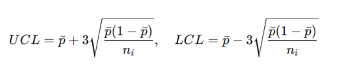
Where ni is the size of each subgroup (e.g., number of calls on Day i). Note that these limits vary per subgroup if subgroup sizes vary — which is a key complexity.
This structure allows us to visualize how proportions of nonconformity (e.g., call hang-ups) behave across time and whether any subgroup proportion violates control limits.
Key Stability Tests and Their Statistical Basis
Stability tests like outlier detection, runs above or below the mean, and consistent trends are based on the properties of the normal distribution. They help identify whether variations are due to common causes or special causes. Statistically, the rarity of these patterns under normal conditions justifies labeling them as signals of instability.
Beyond plotting the data, assignments often require applying a series of tests for statistical stability. These tests are grounded in the properties of the normal distribution and include:
1. Outlier Test
Theory: In a stable process, about 99.7% of subgroup values fall within ±3σ. If a subgroup proportion falls outside this, it’s likely due to special causes.
Interpretation: One or more points outside control limits signal instability. This typically warrants immediate investigation of those specific subgroups.
2. Run of Points on One Side of the Mean
Theory: If 8 or more consecutive subgroups lie entirely above or below the center line, this indicates a shift in the process mean — a sign of assignable causes.
Why It Works: The probability of eight successive points on the same side of the mean by chance is (0.5)8 = 0.0039, which is too rare to ignore in a stable process.
Actionable Insight: Look at the date range of the run to isolate changes in processes, policies, or conditions during that period.
3. Trend Test (Consistent Increase or Decrease)
Theory: A trend of 6 or more points consistently rising or falling indicates a sustained shift — which again defies the randomness expected in a stable process.
Statistical Justification: The likelihood of this occurring purely by chance is extremely low and is typically associated with creeping process changes (e.g., equipment wear, staffing changes).
Root Cause Exploration: Analyze systemic changes (e.g., a new software deployment or a gradual overload on resources) aligned with the trend duration.
4. Cyclical or Repeating Patterns
Theory: A recurring up-and-down pattern over fixed intervals suggests that variation is not random but driven by external cyclic forces (e.g., shift schedules, weekday effects).
Diagnosis: Although individual subgroups may lie within control limits, the consistent pattern itself is a form of instability. Autocorrelation analysis may be necessary for further insight.
Conceptual Workflow for Solving the Assignment
Start by calculating proportions, determining average values, and establishing control limits using the proper chart. Then plot the data, visually assess trends or outliers, and apply each test systematically. Follow this with interpretation based on statistical theory and provide reasoned conclusions supported by specific subgroup behaviors.
Now that we’ve discussed the core theories, let’s walk through a step-by-step strategy — completely theoretical but closely mimicking your kind of assignment.
Step 1: Calculate Proportions per Subgroup
For each day (or subgroup), compute:
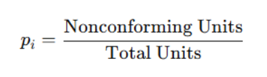
This gives you a time series of proportions that will be plotted.
Step 2: Determine Central Line and Control Limits
Using the complete set of data:
- Calculate pˉ — the average of all pi
- Calculate control limits per subgroup size
- Use MINITAB (or any tool) to create a P Chart with sigma limits displayed
Ensure software does not auto-test the chart, as this is typically requested to be done manually in assignments.
Step 3: Visually Inspect the Chart
Before jumping into tests, take a look:
- Are any points outside the limits?
- Are there visual trends?
- Are any sequences consistently above or below the mean?
This is your first intuitive check.
Step 4: Apply Theoretical Tests
Use the stability tests mentioned earlier. For each:
- List its name (e.g., “Outlier” or “Trend”)
- Say whether it passed or failed
- If failed, identify the specific subgroup numbers and describe what triggered the failure
- Explain using normal distribution principles why this behavior implies instability
Step 5: Justify Your Conclusions
Each test should be explained theoretically:
- Why does this test work?
- What does failure indicate statistically?
- Where should root cause analysis start?
- How does the behavior inform diagnosis?
For example, if a test fails due to points outside control limits on 10/14 and 10/21, suggest checking what happened on those specific dates. Maybe a staffing shortage, a system glitch, or a marketing campaign led to unusually high call volumes or abandoned calls.
Best Practices in Explaining Results
Use test names accurately, refer to subgroup numbers, and tie every observation to statistical principles like the 3-sigma rule. Avoid vague language—explain the cause-effect relationship clearly. Justify conclusions by referencing normal distribution properties and relate observed patterns to potential process changes or anomalies on specific dates.
In assignments like these, the emphasis is not only on correct detection but on interpretation. Here’s how to make your analysis stand out:
- Use subgroup numbers for clarity
- Use the full terminology of the test names
- Tie every failure to a property of the normal distribution
- Never say “probably” — instead, say, “The statistical probability of this occurring in a stable system is less than 0.3%...”
- Make specific, data-aligned recommendations (e.g., “Investigate call center logs for 10/13–10/15 to identify anomalies in operations.”)
Extending the Analysis: When to Use Additional Charts
Moving Range charts or secondary control charts can be used to assess consistency in process variability. They are especially useful when variability between subgroups changes significantly, even if central tendencies remain stable. Such additional analysis enhances interpretation depth and reveals otherwise hidden special-cause variations.
If the assignment permits or requires, sometimes it's useful to create a Moving Range Chart alongside the P Chart. This tracks the magnitude of change from one subgroup to the next.
Use Case for MR Chart:
- You’ve seen variability spike even when proportions remain within limits
- You want to explore how consistent the process variability is, not just its mean
Such layered analysis shows depth and initiative — qualities that score highly in graded assignments.
Final Thought: Stability ≠ Acceptability
One important theoretical point is that statistical stability does not imply a good process. A process can be stable but produce a high defect rate. The purpose of the control chart is to identify whether the process is predictable — not whether it's acceptable.
Hence, you might conclude that the chart is stable but still recommend further process improvements.
Conclusion
Assignments requiring control chart analysis — like the kind we've discussed — are not just plug-and-play problems. They are structured opportunities to apply theoretical principles of statistical process control (SPC) to practical, often business-relevant data.
To solve these effectively:
- Understand chart selection logic
- Apply and interpret stability tests using statistical theory
- Communicate findings with clarity, precision, and context
Approach each chart as a story of the process: what it's doing, whether it's doing it predictably, and where that predictability may be breaking down. By doing so, you not only ace the assignment but also gain a valuable skill for real-world quality and operational analysis.