Creating Bar Graphs, Histograms, and Bar Charts to Depict the Data
Below, Microsoft excel is used to create bar graphs, histograms, and bar charts to show the effect of tornadoes and their duration according to their intensities on the f-scale. Each graph is explained. Then, the type of distribution associated with the duration of the tornadoes is explained. A summary is then given on the experience of the data analyst while undertaking this assignment.
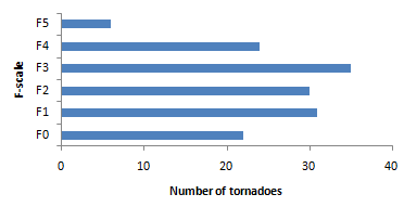
A Bar Graph Depicting the Number of Tornadoes by F-Scale
Explaining How the Frequency of the Severest Tornadoes Compares With Normal Tornado Formation
b. Explain how the frequency of the severest tornadoes the April 3– 4, 1974, outbreak compare with normal tornado formation
As per the graph, it can be seen that little more than 20% (=30/148) of all the tornadoes recorded on April 3-4 1974, exceeded F3 on the Fujita scale i.e. they fell under categories F4 and f5. This is much higher in comparison to the normal tornado formation which is little more than 1%.
Creating a histogram for the distribution of Tornado Duration
2. Time taken by tornado:
a. Create a histogram that displays the distribution of tornado duration for all the tornadoes.
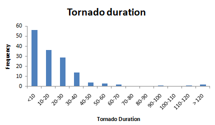
Explaining the Distribution of Tornado Duration According To the Figure Generated
b. Is this a normal distribution? (explain)
No, this is not a normal distribution as it is highly positively skewed with a long right tail. For a distribution to be normally distributed, the graph looks like a bell curve that peaks at the center, and the data is evenly spread around the center and as we move far away from the mean, the frequency starts to decrease and there is very little data in the tails.
Generating 6 Histograms That Show Tornado Duration for Each F-Scale
3. The duration of tornados for F-scale categories.
a. Generate 6 histograms that show tornado duration for each F-scale category.
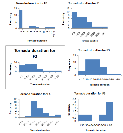
Explaining the Relationship between Duration and Intensity
b. Is there a relationship between duration and intensity (the F-scale category)? Describe.
It can be seen that the lower the intensity (F-scale category), the lower is the duration as the number of tornado durations range from 1 to 10 with the exception of one tornado whose duration is 30. This scale changes to “<5”, “5-10”, ….”>30” in F1, F2. It further changes to “<10”, “10-20”, ….”>60” in F3 and F4 and to “<30”, “30-40”, ……”>60” in F5. Thus, it can be seen that there is a direct relationship between duration and intensity i.e. higher the intensity, the higher is the duration, and vice versa.
4. Death count and tornado intensity.
a. Generate a bar chart to show the relationship between tornado intensity (x-axis) and f deaths (y-axis).
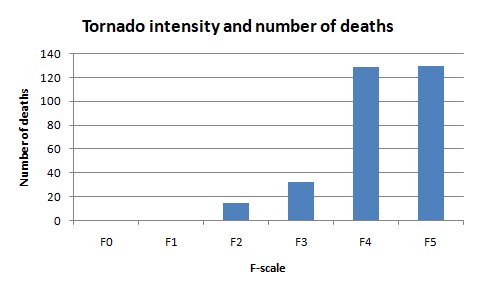
b. The severest tornadoes) account for not less than 70% of deaths. Is this death distribution consistent with the observation? What is the relationship?
In the given data, the most severe tornadoes F-4 (42.3%) and F-5 (42.6%) account for about 85% of deaths which is more than 70% of the deaths. And thus, the death distribution of this outbreak is consistent with this observation. Thus, the most severe tornadoes seem to be very deadly.
Creating a Bar Chart for the Relationship between Community Size and Deaths
5. Number of deaths and community size.
Create a bar chart that shows the relationship between community size (x-axis), and deaths (y-axis).
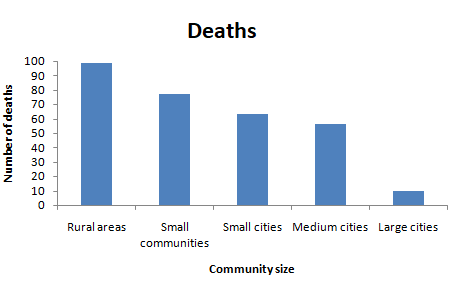
a. Are tornadoes more likely to strike rural areas? Are the number of deaths a function of community size? (2 pts)
About 32% of the deaths due to tornadoes have occurred in rural areas and thus, tornadoes are more likely to strike rural areas. Moreover, the smaller the community size, the larger are the number of deaths and thus, the number of deaths is a function of community size.
Writing a Summary of the Project
6. Summary of the Project.
It took about three hours to complete the assignment. It was interesting. The instructions file was helpful. Creating graphs in excel was the part that I enjoyed the most.