Assignment instructions
1. For each of the following variables, identify 1) the level of measurement and 2) what figure would be most appropriate to visually display the data.
a. Weight (in pounds)
b. Eye color
c. Grade in school
d. Grade point average
e. Temperature
2. Use the frequency distribution table labeled Q2(columns A and B) in the ‘HW2.xlsx’ file to answer the following questions.
a. How many of the scores have the value of 70?
b. What percentage of scores have the value of 30?
c. What is the cumulative percentage of scores at or below 60?
d. Create a column labeled ‘Cumul. %’ and calculate the cumulative percentages. Paste the table below in APA format.
3. You ask 20 people to rate a movie using a 1- to 5-star rating: the higher the number of stars, the higher the recommendations. Use the data labeled Q3 (columns F and G) in the ‘HW2.xlsx’ file to answer the following questions.
a. What level of measurement is this variable?
b. Construct a frequency distribution table of the data. Paste the table below in APA format.
c. Construct an appropriate figure to display the data. Paste the figure belowin APA format.
4. An instructor administers a quiz to her class of 25 students. Each score presented is out of 100%. Use the data labeled Q4 (columns K and L) in the ‘HW2.xlsx’ file to answer the following questions.
a. What level of measurement is this variable?
b. Create a grouped frequency distribution table for these data.Paste the table belowin APA format.
c. Construct an appropriate figure to display the data.Paste the figure belowin APA format.
5. For each of the following sets of data, determine whether the distribution of scores is symmetric or asymmetric (skewed).
a. 9, 7, 6, 8, 6, 13, 7, 6, 5, 6
b. 22, 8, 17, 3, 19, 14, 19, 6, 19, 23, 16, 19, 22, 17, 19, 20
10, 17, 16, 14, 16, 21, 19,
Assignment solution
1. For each of the following variables, identify 1) the level of measurement and 2) what figure would be most appropriate to visually display the data.
a. Weight (in pounds)
b. Eye color
c. Grade in school
d. Grade point average
e. Temperature
Ans: a. 1) Interval 2) Histogram
b. 1) Nominal 2) Pie chart
c. 1) Ordinal 2) Bar chart
d. 1) Ratio 2) Histogram
2. Use the frequency distribution table labeled Q2(columns A and B) in the ‘HW2.xlsx’ file to answer the following questions.
a. How many of the scores have the value of 70?
b. What percentage of scores have the value of 30?
c. What is the cumulative percentage of scores at or below 60?
d. Create a column labeled ‘Cumul. %’ and calculate the cumulative percentages. Paste the table below in APA format.
Ans: a. 6
b. There are 3 students with a score of 30 and in total there are 30 students. Thus, the percentage of scores having the value 30 is 3/30*100 = 10%
c. The cumulative frequency table:
| Score | Frequency | Cumulative frequency |
| 10 | 0 | 0 |
| 20 | 1 | 1 |
| 30 | 2 | 3 |
| 40 | 0 | 3 |
| 50 | 2 | 5 |
| 60 | 3 | 8 |
Thus, the cumulative frequency at 60 is 8. The cumulative percentage is 8/30*100 = 26.67%
d.
| Value | f | Cumul. % |
| 100 | 3 | 100.00% |
| 90 | 8 | 90.00% |
| 80 | 5 | 63.33% |
| 70 | 6 | 46.67% |
| 60 | 3 | 26.67% |
| 50 | 2 | 16.67% |
| 40 | 0 | 10.00% |
| 30 | 2 | 10.00% |
| 20 | 1 | 3.33% |
| 10 | 0 | 0.00% |
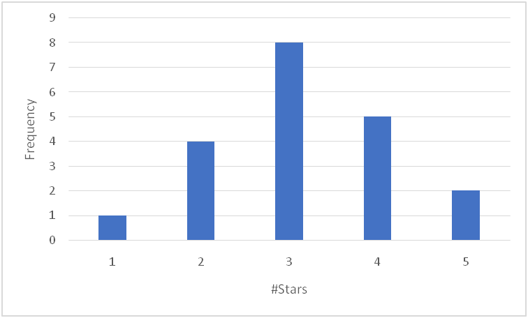
3. You ask 20 people to rate a movie using a 1- to 5-star rating: the higher the number of stars, the higher the recommendations. Use the data labeled Q3 (columns F and G) in the ‘HW2.xlsx file to answer the following questions.
a. What level of measurement is this variable?
b. Construct a frequency distribution table of the data. Paste the table below in APA format.
c. Construct an appropriate figure to display the data. Paste the figure below in APA format.
Ans: a. Ordinal
b.
| #Stars | f |
| 1 | 1 |
| 2 | 4 |
| 3 | 8 |
| 4 | 5 |
| 5 | 2 |
c.
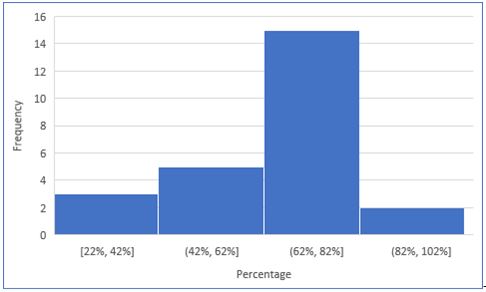
4. An instructor administers a quiz to her class of 25 students. Each score presented is out of 100%. Use the data labeled Q4 (columns K and L) in the ‘HW2.xlsx file to answer the following questions.
a. What level of measurement is this variable?
b. Create a grouped frequency distribution table for these data. Paste the table below in APA format.
c. Construct an appropriate figure to display the data. Paste the figure below in APA format.
Ans: a. Ratio level.
b.
| Range | f |
| 80%-100% | 5 |
| 60%-79.99% | 12 |
| 40%-59.99% | 6 |
| 20%-39.99% | 2 |
c.
5. For each of the following data sets, determine whether the distribution of scores is symmetric or asymmetric (skewed).
a. 9, 7, 6, 8, 6, 13, 7, 6, 5, 6
b. 22, 8, 17, 3, 19, 14, 19, 6, 19, 23, 16, 19, 22, 17, 19, 20
c. 10, 17, 16, 14, 16, 21, 19, 15, 18, 15, 16, 17, 16
Ans: a. Histogram: